Table of contents:
- Kitchen in bright colors: features and design rules
- How bright hues affect a person's mood
- Features of kitchen interior design in bright colors
- Original combinations of bright colors
- Where to apply vibrant colors in your kitchen
- Materials for design and decoration
- Bright colors in different interior styles
- Bright kitchen design rules
- Reviews of the multi-colored kitchen interior
- Author Bailey Albertson albertson@usefultipsdiy.com.
- Public 2024-01-17 22:26.
- Last modified 2025-01-23 12:41.
Kitchen in bright colors: features and design rules

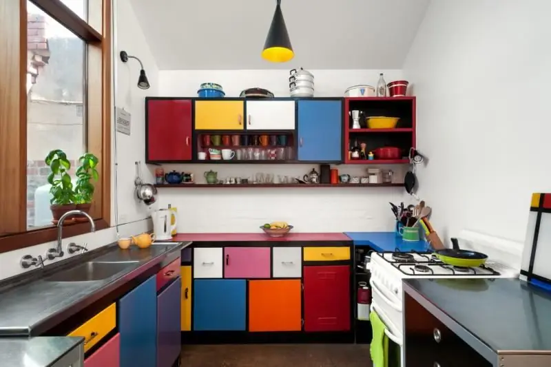
The multi-colored interior of the kitchen is an original solution that many owners of apartments or private houses like. This design involves the use of several bright shades. It is important to combine them correctly, choose the right interior style and take into account other factors. Then the kitchen will be cozy, beautiful and stylish.
Content
- 1 How bright hues affect a person's mood
- 2 Features of kitchen interior design in bright colors
-
3 Original combinations of bright colors
-
3.1 Kitchen interior with blue and green shades
3.1.1 Photo gallery: kitchen design in blue and green tones
-
3.2 Yellow and green in a kitchen setting
3.2.1 Photo gallery: kitchen interiors with yellow and green tones
-
3.3 Red and yellow kitchen interior in the house
3.3.1 Photo gallery: kitchen design in red and yellow colors
-
3.4 Orange and blue in kitchen settings
3.4.1 Photo gallery: blue and orange in kitchen design
-
3.5 Green or yellow and purple for the kitchen
3.5.1 Photo gallery: kitchen design with purple and green colors
-
-
4 Where to apply bright colors in the design of the kitchen
- 4.1 Spectacular furniture
- 4.2 Wall decoration
- 4.3 Floor covering and ceiling
- 4.4 Additional decor and textiles for a bright kitchen
-
5 Materials for design and decoration
5.1 Video: features of wall decor
- 6 Bright colors in different interior styles
- 7 Rules for bright kitchen design
- 8 Reviews of the colorful kitchen interior
How bright hues affect a person's mood
Each color is characterized in a different way and affects the psychological state of a person in a certain way. This criterion must be taken into account when decorating the interior of any room. Therefore, when combining several shades, it is worth considering their features.

Multi-colored interior elements make the kitchen elegant
Primary colors affect a person's mood as follows:
- lilac and violet have a calming effect, but in large quantities they can cause nervous tension, irritability;
- blue and green help to relax, restore strength, do not strain eyes;
- orange and yellow improve appetite, cheer up, but the abundance of such colors can irritate the eyes;
- brown is associated with stability, comfort and reliability;
- red symbolizes action, energy, suppresses appetite;
- a white shade is associated with purity, completeness and the achievement of the ideal in everything;
- black - a shade of strength, elegance, mysticism, but creates a gloomy atmosphere;
- gray is a compromise between black and white, does not distract attention and serves as the basis for bright colors.
Features of kitchen interior design in bright colors
Very rich colors can be used to create a bright and original setting in the kitchen, but this should be done carefully. The abundance of such tones will create a motley interior, from which the eyes will get tired, and being in the kitchen will not be comfortable. And also this space will be very different from other premises of an apartment or house if they are made in a calmer color scheme.

White and gray are neutral tones and one of them must be in a bright interior
Each of the popular bright colors is important to use correctly in the setting:
-
rich red can become the only rich tone in the interior of the kitchen. It can be supplemented with white, black, gray and beige. For example, a scarlet set looks spectacular against a background of beige or light gray walls. To achieve harmony, it is worth picking up red or burgundy curtains, napkins on the table. The scarlet tone can also be emphasized with lemon yellow, blue, silver;

Kitchen interior with a scarlet set Gray makes the interior of the kitchen with a red headset more austere
-
the acid-yellow shade is rarely used in the interiors of living quarters, as the eyes quickly get tired of it. At the same time, it can be supplemented with neutral colors: beige, white and gray. This approach will soften the intensity of the tone. It is best to include small details of this color in the furnishings: napkins, dishes, decor on the walls, countertop. In this case, the main one can be not only a neutral shade, but also light green, orange look good;

Furniture with bright yellow facades in the kitchen Yellow can be easily diluted with neutral colors
-
orange is a bright addition to the kitchen, creating a cheerful atmosphere. This shade goes well with yellow, green, red, brown, emerald. These combinations are bright, and if a more restrained interior is needed, then it is worth complementing the orange with light gray, white, black and beige, light brown. At the same time, bright dishes and textiles are enough to transform the kitchen. You can paint the walls in an orange tone, but the headset should be a neutral color;

Orange set against the background of green kitchen walls Orange and light green create a cheerful combination
-
light green - the brightest tone of the green color palette. It is combined with turquoise, purple, orange, emerald, as well as white, gray, black and beige. So that light green does not irritate, it is worth using it to decorate walls or include textiles, chairs of this color in the interior;

Kitchen with interior in light green and purple colors Bright shades complement light green and create a stylish atmosphere
-
deep blue, or ultramarine, is a practical and relevant shade for the kitchen interior. White will emphasize the brightness of such a tone, and gray, beige, brown or black will soften the saturation of blue. An especially spectacular interior will turn out if you combine ultramarine with green, purple, emerald or yellow;

Blue kitchen set in a bright interior Beige and brown soften the brightness of the blue tone
-
pink is rarely used in kitchen design, as it is associated with romance, childhood and frivolity. There are strict tones of this palette that are optimal for the kitchen setting. For example, dusty pink combined with white or black makes the interior stylish. For a brighter design, you can complement the pink with blue, as well as silver, purple.

Kitchen with a rich pink color in the interior Bright pink gives the space a festive look
Original combinations of bright colors
The kitchen can be decorated in any color, but there are several especially effective combinations that ensure the originality of the interior. In any case, you need to take into account the saturation of the shades, because one bright tone can be combined with another paler. This will make the design harmonious.
Kitchen interior with blue and green shades
The combination of green and blue colors is a common solution for the interior of a stylish kitchen. For this, you can use both pale and saturated tones. In the first case, the situation will be light and light, and in the second - bright and unusual.
Photo gallery: kitchen design in blue and green
-

Spacious kitchen in blue and green tones - White dilutes bright green and blue tones
-

Blue and light green in the kitchen setting - For a small room, light shades are optimal
-

Kitchen in blue set and green details - Bright blue can be complemented with pale green for a harmonious interior
-

Blue-green set in the kitchen in the house - Blue and green are combined with brown, ideal for flooring
-

Kitchen with blue wallpaper and green furniture - Dark wallpaper visually reduces space
-

Kitchen with blue furniture and green details - Bright colors look impressive against light
-

Bright blue-green furniture in a small kitchen - A headset with a rich color requires a light background
-

Dark blue furniture and green details in the kitchen setting - A deep blue shade must be complemented with light tones, otherwise the room will be gloomy
-

Blue and green decor in the kitchen - Blue and green details can only be in small quantities for kitchen decoration
-

Bright set on the background of a blue kitchen apron - Two-tone set - a common option for a bright kitchen design
-

Greenish furniture in the kitchen - The interior may be dominated by one of the bright colors.
-

Blue furniture against green walls - Blue looks harmonious with brown flooring
-

Green curtains in the kitchen-dining room - A dark blue hue is easy to complement with a bright green
Yellow and green in a kitchen setting
The combination of green and yellow colors in the interior is cheerful and elegant. They are easy to complement with neutral colors. And you can also create a laconic and simple atmosphere, but add bright objects, wallpaper in yellow-green tones, dishes. In any case, it is best to choose tones that are pleasing to the eye, rather than acidic shades.
Photo gallery: kitchen interiors with yellow and green tones
-

Kitchen interior in light yellow-green tones - Pale shades combined with white visually expand the room
-

Green set and yellow apron in the kitchen - White background is suitable for bright interior details
-

Yellow-green set and brown apron in the kitchen - Brown makes bright colors more strict and solid
-

Bright apron and yellow set in the kitchen - Solid color set can be supplemented with a printed apron
-

Kitchen set in bright color - Beige serves as a good base for a yellow-green headset
-

Green-yellow kitchen - The original flooring will make the interior stylish
-

Green-yellow design of a small kitchen - Calm green and yellow shades will ensure the harmony of the interior
-

Yellow set and green furniture in the kitchen - A small amount of green details can complement the yellow set in the kitchen
-

Green apron and yellow furniture fronts in the kitchen - A yellow set is an excellent solution for an elegant kitchen
-

Stylish yellow-green kitchen furniture - In a spacious kitchen, you can install furniture of an unusual shape
-

Green furniture in the kitchen in a private house - Green harmoniously combines with light brown
-

Kitchen interior in light colors - Pale yellow combined with green will make the kitchen original
-

Kitchen set yellow-green - Two-tone headsets allow you to diversify the interior
-

Kitchen furniture with a pattern on green facades - Yellow apron will complement wardrobes with green fronts
Red and yellow kitchen interior in the house
A bright scarlet color and a juicy yellow shade harmoniously complement each other. This combination is ideal for a modern and stylish kitchen. The shades create an effective combination and therefore should be complemented with white, gray, black or beige details. For example, a common solution is a bright headset against a light wall. Additionally, they use yellow or red napkins, watches and other decorative items.
Photo gallery: kitchen design in red and yellow colors
-

Bright walls in the interior of the kitchen - A simple kitchen set looks harmonious against the background of bright walls.
-

Scarlet set and yellow decoration in the kitchen - A kitchen with red in the interior can become a cozy room with the help of textiles
-

Red furniture in a narrow kitchen - Scarlet details are appropriate in a kitchen of any size
-

Red set with yellow details in the kitchen - Two-tone facades decorate and make furniture spectacular
-

Stylish kitchen furniture and wallpaper - Bright furniture looks good against a background of pale, patterned walls
-

Yellow furniture and red apron in the kitchen - Beige color easily complements yellow furniture and red decor in the kitchen
-

Dark red set and yellow wall in a small kitchen - Dark furniture lends solidity to the setting
-

Narrow kitchen with yellow and red furniture - Bright colors are appropriate even in a narrow and small kitchen
-

Bright walls in a kitchen setting - Only walls can be bright in the interior.
-

Modern design of a bright kitchen in an apartment - A set of any color must be supplemented with details of a suitable shade
-

Laconic kitchen with yellow cabinet fronts - Pale shades look spectacular against bright
-

Multi-colored spacious kitchen in the house - Red is often replaced with raspberry or pink
Orange and blue in the kitchen setting
The room, decorated in orange and blue colors, looks extraordinary. These rich shades make the space memorable, spectacular, and therefore it is worth considering every detail.
If you need to create an impressive and unusual interior, then you should choose bright orange and deep blue colors. A two-color set against a background of pale blue or gray walls is a simple and original solution for the kitchen. And you can also highlight the wall near the dining table in orange, and paint the rest of the walls blue. In this case, the furniture will be bright blue.
To create a light and light interior, it is best to pay attention to pale orange and blue shades. They are appropriate both in a laconic design, made in neutral colors, and as a main accent. In this case, it is worth combining less orange and more blue, since many orange details will be conspicuous, and the rest will lose their significance.
Photo gallery: blue and orange in kitchen design
-

Kitchen in orange and blue design - White will harmonize the interior with orange and blue colors
-

Orange set against a blue kitchen wall - A bright interior can be tiring, but it looks very stylish.
-

Delicate combination of blue and orange in a kitchen setting - Blue and orange combined with beige provide a pleasant environment
-

Orange-blue kitchen interior in the apartment - The main accent of the kitchen is often a bright set.
-

Orange furniture and dusty blue walls in the kitchen - Geometric flooring will brighten up even a bright kitchen
-

Marine style kitchen with orange cabinets - Bright colors are always diluted with neutrals, providing a harmonious setting
-

Dark blue and orange in the design of a small kitchen - Expressive tones require good lighting and the right addition
Green or yellow and purple for the kitchen
One of the unusual combinations in the interior is a combination of purple and green or yellow shades. These colors can be bright or faded, depending on the atmosphere required in the room. If the design is bright, then a two-tone set and a bright wall of the dining area are suitable for this. For a laconic and pleasant environment, it is best to use lilac and light green shades.
Photo gallery: kitchen design with purple and green colors
-

Yellow and dark purple details in the kitchen setting - A room with a dark interior requires bright lighting
-

Two-tone violet-green kitchen set - A dark set on a light background makes the setting spectacular
-

Patterned and bright set in the kitchen - It is easy to place an unusual headset with patterns in a kitchen setting.
-

Purple apron and green furniture in the kitchen - A bright apron can be additionally decorated with patterns
-

Lilac and light green in the kitchen - Pale colors make the room cozier and lighter
-

Purple details and green furniture in the kitchen - A bright set will complement a wall with a pattern in a similar color scheme
-

Two-tone furniture and a beautiful apron in the kitchen - The apron is often matched to the color of the headset.
Where to apply vibrant colors in your kitchen
When decorating a space in rich colors, you should determine the area of application of the shades. This allows you to focus on certain objects, visually adjust the room.
Spectacular furniture
Furniture is often used to create a bright interior. The set, chairs, dining table and other items become the main decor of the room. They do not need additional decoration, but such furniture is best placed against a background of a neutral color. For greater harmony in the interior, small details of the same color as the cabinets may be present.

An apron in the color of the headset is the optimal solution for a harmonious environment
Wall decoration
The bright color of the walls is a good opportunity to highlight the laconic furniture in the kitchen. Lilac, blue, green and other tones are often combined with gray, white or beige. Curtains can be of a contrasting shade or color of the same range as the walls. If striped or patterned wallpaper is used, then the fine decor should be matched to the color of the picture.

Only one wall in the kitchen can be made bright
Floor covering and ceiling
The floor and ceiling rarely have a bright color, but such a design will certainly make the atmosphere memorable and original. It should be borne in mind that the dark ceiling visually makes the room lower, and the slightest dirt is noticeable on the dark floor.
A geometric or other pattern on a bright ceiling or flooring makes the surface more dramatic. The color of these areas should be repeated in the interior, for example, on an apron, dishes, textiles.

The color of the flooring can be repeated in other interior details
Additional decor and textiles for a bright kitchen
Tablecloths, napkins, curtains, carpet, dishes and other details will help to create a spectacular interior in the kitchen. They can be combined with a headset, flooring, walls, apron. If the decor differs in tone from the main accents of the interior, then this will help diversify the design. And also bright accessories are in demand for the design of a laconic space, made in neutral colors.

Curtains can easily become the main accent in the kitchen.
Materials for design and decoration
When decorating your kitchen, it is important to use practical materials that can be easily cleaned and washed with suitable products. The following structures are popular:
- plastic is often used for an apron, decoration of furniture facades. Elements of bright color with a smooth surface are optimal for the kitchen, because patterned details in large quantities make the interior colorful;
- metal is used for furniture parts, chandeliers, plumbing;
- glass is suitable for an apron and can be of any color and with different patterns;
- ceramic tiles are often used for flooring, apron. With the help of multi-colored elements, it is easy to create any pattern on the surface. For the kitchen, tiles with a smooth structure are convenient, since a rough one will quickly get dirty and difficult to clean;
- the ceiling can be stretch or plasterboard. In any case, you need to place bright lighting devices on it for comfort in the kitchen.
Video: wall decor features
Bright colors in different interior styles
The use of rich colors in an environment requires a preliminary selection of the design style. Depending on this, materials for finishing are also selected.
Most often, bright colors are used in the following types of designs:
-
Art Nouveau style is characterized by the severity of forms, laconic decor, but one bright color is appropriate in the interior, as well as chandeliers of unusual shape, original decor;

Modern kitchen with a bright set One bright color is appropriate in the modern interior
-
high-tech assumes an abundance of household appliances and electronics, shiny metal surfaces, a minimum of accessories and decor, but one bright color is appropriate in the interior, for example, on furniture or flooring. Curtains or other details may mimic this shade;

Black and white kitchen with red details Geometric pattern and bright color can become the main decor of a high-tech room.
-
eclecticism is a combination of different styles and materials, a combination of several similar styles, a large number of textiles in a setting. 2 - 3 bright colors are required. Popular painting the main wall in a rich tone, the use of draperies;

Eclectic kitchen with vibrant details In the eclectic style, several bright colors and aged details are appropriate
-
pop art is a bright style characterized by creativity and originality. In this design, 3 bright colors are appropriate, decorative posters and inscriptions, furniture and chandeliers of unusual shapes.

Pop art kitchen with original curtains Unusual images are an important feature of the pop art style
Bright kitchen design rules
When using saturated shades in the design of the room, you should take into account such rules as:
- applying no more than 3 bright colors to design a room. Otherwise, the interior will be too colorful, which will negatively affect the person's mood;
- a large number of bright colors can be easily diluted with neutral ones: black, beige, gray and white. It can be textiles, furniture, walls;
- on a white background, bright details look especially contrasting than on the basis of another shade;
- light colors in combination with white provide lightness of the interior, visually enlarge the room;
- dark colors will help to visually reduce the room and make it more comfortable.
Reviews of the multi-colored kitchen interior
The use of rich shades in the interior is a bold decision, but for this you need to determine whether the tone suits the owner of the apartment, whether the color will not irritate. If you are not sure about the optimal choice, you should limit yourself to pale colors that will provide a pleasant interior.
Recommended:
The Interior Of The Kitchen And Living Room In The Style Of Minimalism: Examples Of Design, Choice Of Colors And Materials, Decoration, Photos
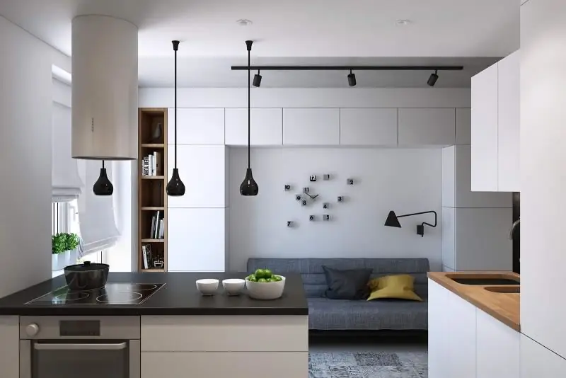
Minimalism style principles, choice of shades and materials. Features of the arrangement of the kitchen in the style of minimalism, design rules and decor ideas
High-tech Kitchen And Living Room Interior: Examples Of Design, Choice Of Colors And Materials, Decoration, Furniture, Accessories, Photos, Videos
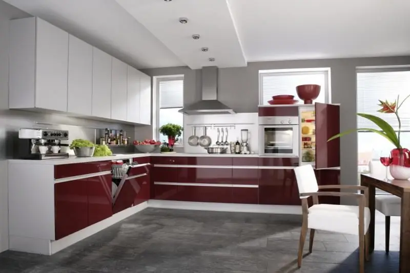
High-tech style features and how to decorate the kitchen interior. How to choose colors and materials for design and how to combine other styles with high-tech
Interior Of The Kitchen In A Marine Style: Examples Of Design, Choice Of Colors And Materials, Wall And Floor Decoration, Furniture, Accessories, Photos, Videos
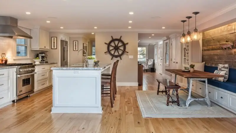
The principles of nautical style in the interior of the kitchen and suitable materials for its arrangement. Room decor, design ideas and lighting choices. Tips for finishing
Kitchen Interior In The Style Of Shabby Chic: Examples Of Design Design, Choice Of Colors And Materials, Decoration, Furniture, Accessories, Photos, Videos
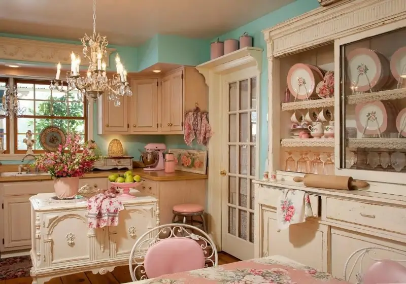
How to decorate a shabby chic kitchen. The main features of the style and the difference from Provence. How to decorate walls, floors and ceilings, how to choose furniture, plumbing and accessories
Kitchen Design With A Bay Window: Modern Design Solutions And Original Ideas, Photo Examples Of Design
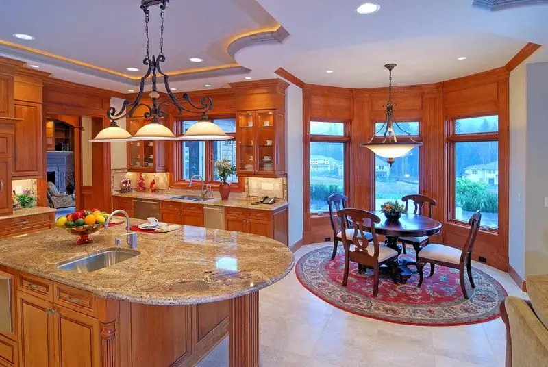
The concept of a bay window, its advantages and disadvantages. How to decorate a kitchen with a bay window - choose the right design, colors and materials
