
Table of contents:
- Author Bailey Albertson albertson@usefultipsdiy.com.
- Public 2023-12-17 12:53.
- Last modified 2025-01-23 12:41.
Let's argue about tastes: interior antitrends 2019

It is always curious to know what is being admired now, what tricks in interior design are popular, how to make your home better. Trends often become anti-trends because they have more practical and functional counterparts. But not all blacklisted solutions in 2019 are worth getting rid of.
Deliberate stylization
Paradoxically, today it is not fashionable to mindlessly follow fashion. The style must match the room. For example, a small kitchenette should not look like a refectory in a palace, an ordinary living room should not look like an antique temple, and a single room with low ceilings should not look like a loft attic. Those. before decorating a particular room in a particular style, think about whether it suits this room.

If the kitchen is 9 sq. meters arranged as a palace hall, it seems overloaded
Overloaded with accents
Interiors are becoming calmer, so in 2019 they are no longer fashionable:
-
decorative plaster, textured paints, bas-reliefs, especially in bright colors - they were replaced by a shallow texture on accent walls (for example, brickwork or its imitation) without color highlighting;

Bas-reliefs in the interior of the living room Although the brick is already receding into the background, it always looks better than the highlighted bas-relief
-
combination of 2-3 types of wallpaper with large different patterns - monochromatic painting and different textures have become fashionable;

Wallpaper with a large pattern If you are not sure that you can very accurately and dosed fit accent wallpaper into the interior, choose canvases for painting
-
a combination of bright facades and a contrasting kitchen apron (skinned with photo printing, 10x10 cm tiles, mosaic), designers especially do not like the addition of imitation of carving on furniture, deep milling and gloss to these errors - painting facades and an apron in one color or a combination of a neutral kitchen is in fashion and accent apron and countertops (complex color or with high-quality imitation of stone, concrete, wood);

Kitchen with photo printing Kitchens are becoming more laconic, but this is not a reason to give up tasty shades.
-
a lot of pictures, figurines, souvenirs, etc. - paintings up to 30% of the width of the wall and more, collages of small objects, a changing exhibition of figurines on half-empty shelves are relevant;

Visual noise in the interior One has only to overdo it with the details, and the restrained white-gray-yellow interior turns into kitsch
-
the use of tiles in bright colors in combination with colorful décor - when making renovations, choose large-format tiles for wood, marble, onyx and add accents in textiles, neutral tube boxes and white towels;

Tiles with bright small patterns and monochromatic large-format in the bathroom interior If there is no intention of creating a Moroccan style, give up bright tiles with small patterns.
-
skeletal lamps and other angular objects - they give way to rounded shapes.

Skeleton lamp and lamps with shades of different shapes When choosing a new luminaire, give preference to metallic or white shades
Perfectionism
Interiors created according to all the rules seem to designers too similar and boring. They recommend adding character with things “with history”: restored vintage furniture, antique figurines, faded family photos in modern frames.

Grandfather's table next to designer plastic chairs is a common tandem in European interiors
If you tried to achieve the ideal, taking out smooth walls for painting, then you have already received a vaccination against perfectionism. You can breathe a sigh of relief - now the flaws add charm.
Video: interior fashion 2019
What happened before
In 2015-2018, designers disowned such decisions:
-
complex structures made of plasterboard - you can sew up the entire wall to insulate or hide the radiator, but you cannot build shelves;

Sophisticated and simple plasterboard ceilings Complex plasterboard structures have finally faded into the background, even the load-bearing beams should not be sewn up
-
colored lighting of the ceiling and furniture - it is recognized as suitable only for cafes and clubs, the white contour of the ceiling to create a floating effect and a UV lamp for plants with pink light are still in vogue, disco lighting is allowed only in teenage rooms;

Colored and white lighting in the interior To make RGB lighting relevant, just hold it in white light mode.
-
colored glossy stretch ceiling - white satin and matte fabric are welcome;

Stretch ceilings made of glossy film and fabric The perfect modern ceiling creates an inconspicuous backdrop for the luminaires
-
wenge at the same time in doors, floors, baseboards and furniture - for dark doors, choose a wardrobe in beech or bleached oak, the combination of wenge with warm milk is also boring, so paint the walls in cold complex tones, for example, gray-blue, gray-blue or muted turquoise;

The combination of wenge color with warm and cold tones in the interior Cold and light shades emphasize the sophistication of dark wenge
-
decorative framing of openings with "torn stone" and plaster imitations - without deviating from fashion, you can protect the outer corners with door fittings or cover the entire wall with stone, tiles, clinker;

Stone in the interior The brutal texture of natural stone remains relevant, it is simply used in a different reading
-
sliding wardrobes with a thick profile and external radius shelves - replace them with built-in sliding models with frameless fronts or swing doors;

Sliding wardrobes with mirrored fronts Fans of wardrobes do not have to give up mirrored doors, because frameless fronts make these storage systems elegant and weightless
-
total beige, gray or white - the interior should have a neutral base, but contrasting pillows, blankets, curtains are also needed;

Monochrome interior with and without accents Just one bright spot strongly refreshes the interior
-
strict adherence to one interior style, even scandi - bring accents from classics, chalets, pop art, glamor or other impressive direction.

Mixing styles in the interior In order not to make another boring interior, designers advise adding a fair amount of midsenchuri to scandi
All of these items continue to be anti-trends. But in 2019, narrow simple arches are back in fashion. And also photo wallpapers and textiles with large flowers are returning. Therefore, you should not give up a good solution just because the designers wanted something new.

Photorealistic flowers on a dark background - a fashionable highlight for fans of photo wallpaper
Video: signs of an outdated interior
Antitrends 2019 support the trend of making life easier. You no longer need to sacrifice practicality in favor of beauty, spend money on the perfect alignment of the walls, assemble furniture sets. To make the interior fashionable, it is enough to strive for convenience and not get carried away with fashionable chips. And if 1-2 anti-trends appear in the house, they will become your individual highlights.
Recommended:
DIY Repair Ideas In A Children's Room, A Photo Of A Nursery Design, How To Decorate A Nursery, A Nursery Interior Design With A Video
DIY repair and decoration of a children's room. Practical advice on the choice of materials, colors, space zoning
The Interior Of The Kitchen And Living Room In A Loft Style In An Apartment And A Country House: Examples Of Design Design, Choice Of Color And Material, Decoration, Photo
The main features of the loft style and how to decorate the kitchen in such a design. The choice of materials, colors and textures for finishing. Loft-style lighting and decor for the kitchen
Classic Kitchen Design In White: Examples Of Classic Interior Design, Wall And Floor Decoration, Furniture, Accessories, Photo Ideas
White kitchen in a classic style: pros and cons, materials and texture of the facades. Combination of white with other colors. Features of the interior of a white kitchen. Reviews
Kitchen Interior In The Style Of Shabby Chic: Examples Of Design Design, Choice Of Colors And Materials, Decoration, Furniture, Accessories, Photos, Videos
How to decorate a shabby chic kitchen. The main features of the style and the difference from Provence. How to decorate walls, floors and ceilings, how to choose furniture, plumbing and accessories
Kitchen Design With A Bay Window: Modern Design Solutions And Original Ideas, Photo Examples Of Design
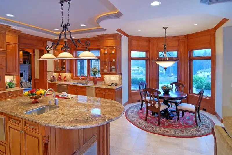
The concept of a bay window, its advantages and disadvantages. How to decorate a kitchen with a bay window - choose the right design, colors and materials
