Table of contents:
- Author Bailey Albertson albertson@usefultipsdiy.com.
- Public 2024-01-17 22:26.
- Last modified 2025-01-23 12:41.
Crystal clear space: kitchen in white

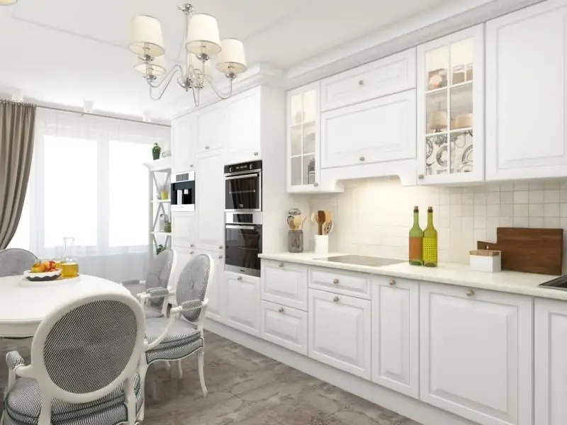
An illiterate organization of the space of a white kitchen is fraught with the transformation of the premises into a doctor's office. In order for the color of the snow to bring the room for eating not harm, but benefit, including visually increasing the area, you need to take a responsible attitude to the choice of materials, furniture, lighting fixtures, accessories and many other things.
Content
- 1 Pros and Cons of White Kitchen
-
2 Texture and materials of white facades
2.1 Video: white glossy kitchen
-
3 Combining white with another in a classic kitchen
3.1 Photo gallery: combinations with white
-
4 Features of the interior design of a white kitchen
- 4.1 Furniture
-
4.2 Kitchen set
4.2.1 Photo gallery: white kitchen set
- 4.3 Household appliances and faucets
-
4.4 Floor, ceiling and wall decoration
4.4.1 Photo gallery: what can be the ceiling and floor in a white kitchen
- 4.5 Window decoration
- 4.6 Accessories
- 4.7 Lighting
- 5 Reviews
Pros and cons of white kitchen
Arguments in favor of arranging a white kitchen:
- production by furniture factories of a wide range of products suitable for a white room;
- the ability to combine shades of white, presented in a huge spectrum (cream, pearl, milk, cream, etc.), with many other tones;
- the beneficial effect of white, devoid of aggressive and annoying notes, on the psyche,
- instant detection and elimination of dirt (which cannot be done in a dark kitchen);
- relative cleanliness, because on white (only glossy, not matte) smudges and water drops are not visible;
- the unchanging popularity of white.
Reasons against creating a white kitchen:
- gradual acquisition of a yellow or gray tint;
- a noticeable layer of dust when combined with objects of other colors;
- the occurrence of apathy with an abundance of white, not diluted with warm tones.
Texture and materials of white facades
Building raw materials for arranging the facades of a white kitchen can be:
-
plastic. The material does not suffer from sudden changes in temperature and constant dampness, and it costs little. Unfortunately, it quickly becomes covered with scratches, depriving the glossy white surface of its attractiveness;

Plastic facade in a white kitchen The plastic facade is completely impervious to moisture
-
solid wood. Raw materials are painted only with expensive high-quality paint and are characterized by high strength and durability. This material needs periodic processing with special means that slow down the loss of its original appearance;

Solid wood kitchen facade A wooden facade can quickly deteriorate due to high humidity, so it must be covered with a protective agent
-
chipboard (chipboard). The raw materials are notable for their availability and decent appearance, but they are inferior to solid wood in terms of quality and service life;

Particleboard facade in a white kitchen Particleboard facade is popular due to its low cost
-
compressed chipboard (MDF). The material has a dense structure, which provides them with better quality than loose and brittle chipboards.

Facade from MDF in a white kitchen Facade made of MDF is more beautiful and of higher quality than a facade made of chipboard
In terms of texture, white kitchen facades are matte and glossy. The first option creates the feeling that the room absorbs light and softens the atmosphere.

Matt surface gives softness to kitchen furnishings
And the second option is much more practical: spots are less noticeable on a sparkling surface. Gloss tends to reflect, which makes the kitchen visually seem more spacious than it actually is.

Glossy white kitchen sparkles for extra volume
Video: white glossy kitchen
Combining white with another in a classic kitchen
The following color options for the kitchen are considered the best:
- white and green with an atmosphere of serenity. The apron, countertop and upper facade of the headset are usually decorated in white, and textiles, dishes, tablecloth, accessories and the lower facade of the headset are usually decorated in green. For a spacious room, the most commonly used green tones are "fern", "asparagus" and "myrtle". If you want to increase your appetite, it is recommended to opt for shades of lime, spring greens and olive;
- trendy black and white, where the base shade is white. The set in such a kitchen is mostly white. In most cases, the table top is made black, and the table is used light. The room is decorated with glass fittings, futuristic elements and chrome fittings;
- cheerful white and orange. Orange is predominantly chosen for the lower facade of the headset. The doors of the upper cabinets are painted only white or alternate orange and white. The apron is often decorated in an orange theme;
- calm gray-white. Often, the upper cabinets are created in light colors, and the lower ones in gray, so that the spots on them are invisible. A common variant of staining the whole kitchen in gray, except for the countertop, floor, apron and table. When decorating a room, both dark and light gray are used. Smoky areas of the kitchen are sometimes obtained using marble, porcelain stoneware, natural and artificial stone. Chairs with natural wood color are placed indoors;
- creative red and white. With a lack of space, white is made the dominant color. The best color ensemble is a muted brick shade and a warm white tone like baked milk. Furniture in such a palette can be completely simple, because the combination of scarlet and white looks spectacular. It is more advisable to build a red-and-white kitchen set from light synthetic raw materials such as plastic, MDF or chipboard. Furniture in such a room does not interfere with surrounding with a large amount of glass and chrome-plated metal elements;
- white and blue. White in the room, as a rule, is the floor, walls, apron and ceiling, and blue - furniture, textiles and some decorative elements. The blue in the kitchen visually expands the space. But with the color combination "blue plus white" you need to be careful: to avoid turning the room into an icy iceberg in cold tones, you need to bring in a little warmth with the help of gilded furniture fittings.
Photo gallery: combinations with white
-

White kitchen with blue accents -
By creating accents in the kitchen with blue, you can achieve a visual increase in space
-

White kitchen with elements of different colors - If the base color of the kitchen is white, then it is permissible to decorate it with small items of other colors.
-

White kitchen with brown elements - Interspersed with brown creates a warm atmosphere in the kitchen
-

Black and white kitchen with brown areas - The kitchen can be painted in black, white and light brown colors at the same time
-

White kitchen with gray walls - White goes well with gray if the walls are painted in the second color
-

White and gray kitchen with brown chairs - Together with gray in a white kitchen, you can use a little brown
-

White and gray kitchen with gray appliances - It is better if the refrigerator and stove are gray in a bright kitchen.
-

A kitchen where white and red stripes alternate - The kitchen turns out to be interesting if its walls have stripes of red and white, and the countertop is painted in white.
-

Black and white kitchen with dark window frames - Dark in a white kitchen can be made for window frames, chair legs and the lower area of the table.
-

White and blue kitchen with blue table - The kitchen will look fresh if the lower area of the table is blue in it.
-

White kitchen with golden elements - Put golden chairs in a white kitchen and the atmosphere of the room becomes sunny.
-

White kitchen with golden chandeliers - In addition to chairs, chandeliers can be made golden in the kitchen
-

Red and white kitchen - White top and red bottom look trendy
-

White and blue kitchen - In a white-blue kitchen, decorative gilded elements should be present
-

White-green kitchen - In the green and white kitchen, any hostess will feel calm and comfortable.
-

White kitchen with green facades - It is preferable to make the facades of the kitchen green, and the apron in white.
-

Orange-themed cuisine - The kitchen in white-orange color will be decorated with an apron with painted oranges
-

White and black kitchen with a dominant white color - Often only the work area is represented in black in a white and black kitchen.
-

Corner white and green kitchen - A corner white-green kitchen looks especially fresh if one wall of the room is painted green
-

Black and white kitchen - Black and white kitchen looks impressive with a reasonable combination of contrasting colors
-

Gray and white kitchen - The lower area of the kitchen is most often painted in gray.
-

Simple red and white kitchen - Red color can make any, even a simple environment, creative.
-

Gray and white kitchen with wood floor - In a room where white is combined with gray, you should put wood on the floor.
Features of the interior design of a white kitchen
The choice of white dictates its own rules for the kitchen.
Furniture
Wooden shelves, open shelves made of MDF with glass, wide sinks, wooden stools or plastic white chairs with metal legs and rectangular large tables made of solid wood perfectly fit into the interior of a white classic kitchen. The last light-colored piece of furniture should not be covered with a luxurious openwork tablecloth: this is completely unnecessary.

Shelves and open shelving work well in a white kitchen
The large kitchen can be additionally furnished with a small cupboard for dishes, a service and a bar with golden handles. It is desirable that all these interior items have the effect of "wear and tear" or "rough processing", which will successfully emphasize the elegance of the snow-white room for eating.

For a white kitchen, you can use artificially aged furniture.
If the design of the kitchen focuses on romance, then among the wide variety of tables, chairs and stools, you need to choose round-shaped models with upholstery.

In a white kitchen, you can arrange not only simple stools, but also chairs with luxurious upholstery.
The color of the table and chairs should be slightly richer than the white tone of the walls and kitchen set, that is, light gray, brown or beige

Light brown is suitable for a table in a white kitchen.
Kitchen set
The material for the manufacture of kitchen countertops can be laminated particle boards, as well as artificial or natural stones.
The most popular option is chipboard with wood imitation: this building material looks good on a white background and lasts a long time, despite the relatively low cost. And it is not recommended to choose a chipboard countertop copying a structure made of stone or marble when arranging a light kitchen: it looks strange and too simple.

The wood-look chipboard top is a great alternative to the solid wood worktop
If the initiator of the transformation of the kitchen into a white sparkling room is ready to spend a lot, then he can purchase a countertop made of artificial or natural stones.
The apron of a white kitchen is usually created from natural wood, stone, glass, tiles with a matte, glossy or textured surface, panels, decorative plaster, red or white bricks

White brick makes an apron as elegant as a tile
The apron of a white kitchen can be decorated in contrasting colors. Interesting combinations - red with gray, blue with black, black and white. They will turn the apron into a stain, involuntarily making you pay attention to the cleanliness and non-standardness of the room for receiving and preparing food.

The kitchen apron does not have to be white, you can pick up interesting patterns and rich colors for it
The most suitable set for a white kitchen is light with areas of red, brown or golden hue. It can be represented by wall cabinets with swing doors, an elegant sideboard and a solid wood shelving. This material is easily covered with paint and looks good in combination with glass, porcelain stoneware and natural stone.
Photo gallery: white kitchen set
-

White headset with a bright apron - In combination with the bright colors of the apron, the white headset looks completely clean
-

White kitchen set - When arranging a white kitchen above and below, it is allowed to install different types of cabinets if their colors are combined
-

Black and white kitchen set - White countertop and black cabinet doors are great for a white kitchen
-

White set with glass doors - The white set goes well with glass
-

Backlit white kitchen set - The headset can be backlit with spotlights
-

White and red kitchen set - Cabinets of different heights can be mounted on the wall, if appropriate
-

White set with brown top - Next to a white headset, black household appliances look good when the transition to dark is smooth
-

Sparkling white kitchen set - There is no need to make a white kitchen set completely white, it may contain golden elements
-

Stone countertop - The stone countertop fits perfectly into the interior of a white room
-

Light set of snow-white kitchen - White cabinets in a bright kitchen are combined with brown wooden shelves
-

Headset with silver handles - White headset looks impressive when it has silver handles
-

Above is white, and below is a red set of a light kitchen - The top of the kitchen unit can be white, while the bottom can be darker, such as red
Household appliances and faucets
In a white kitchen, it is better to use a built-in refrigerator and a medium-sized stove. There are no special requirements for the color: it can be either standard white, or gray, black or red.
Plumbing in white kitchens is sometimes patinated. Thanks to the golden coating, the mixers will make the whiteness of the room less harsh.

For a white kitchen, it is advisable to choose a golden mixer
Floor, ceiling and wall decoration
White kitchen walls should be washable directly at the stove and dining table. A suitable shade is "edible", such as peach, pinkish, cream, milk chocolate or caramel.

The walls of a white kitchen should have a pleasant, not harsh shade.
The ceiling of a room, where white color prevails, is more advisable to whitewash, paint or cover with a light stretch ceiling. The headspace in a white kitchen can be bluish or slightly yellow (pearl or cream).

On the ceiling of a white kitchen, the color of the headset may be repeated
When arranging the floor of a white kitchen, you must not allow it to merge with the ceiling. The surface under your feet should be darker.
A textured and moisture-resistant laminate with a shade of "bleached oak", porcelain stoneware copying white marble with gray lines, and tiles with bright edging and baseboards are considered a win-win option for flooring material.

The floor of a white kitchen cannot be lighter than the ceiling and walls
Photo gallery: what can be the ceiling and floor in a white kitchen
-

Light brown floor in a white kitchen - The entire kitchen space, except for the floor and some elements, can be light
-

Dark floor of a white kitchen - The color of the floor is allowed to be made dark brown if there is brown furniture in the room
-

Floor and ceiling of a white kitchen - The floor and ceiling of a white kitchen differ significantly in color, but it is important that the base shade of the latter is much lighter
-

Floor and ceiling are the same color - For the ceiling and floor, it is allowed to select materials of the same color, if the top and bottom of the room are separated by dark objects
-

White kitchen walls - Despite the fact that all areas of the kitchen, including the walls, are white, the shade of the floor is slightly darker
-

Floor and ceiling of gray and white kitchen - Since there are gray areas in the kitchen, gray and white tiles have been laid on the floor
-

Floor and ceiling of a white kitchen with a brown table - On the ceiling, brown beams look organic, since the floor and table in the room are also brown
-

White kitchen with laminate flooring - The brown laminate on the floor only emphasizes the advantages of the white walls of the kitchen
Window decoration
Curtains and curtains for a white kitchen are selected based on which side of the world the window is on. If it faces north, then the most suitable shade of textiles will be warm. And it is preferable to curtain the south window with fabrics of cold colors.

Cool curtains are suitable for the kitchen if the window is on the north side of the house
When the kitchen is replete with white, the window textiles can be colored. But in this you need to adhere to the norm: the abundance of patterns will give the room a strange motley look.
Accessories
In a white kitchen, flower pots, salt shakers, pepper shakers, potholders, towels and pictures painted in the style of "pop art" will be completely useful interior elements.

An interesting picture can revive the atmosphere of a white kitchen

A white kitchen can be decorated with ordinary flower pots, which will bring juicy colors into the surrounding space.
Lighting
White color does not accept darkness - it needs pronounced lighting both during the day and in the evening.

A white kitchen shouldn't be lit by one chandelier
Therefore, lamps in a white kitchen must be placed so that they give the effect of a large-scale filling of the room with light. In other words, a white room requires built-in spotlights or multiple wall sconces.

Spotlights give a white kitchen a particularly bright light
Reviews
A white kitchen has nothing to do with boredom if it is properly designed. Having successfully chosen finishing materials, furniture and headsets, from a simple room for eating it turns out to be a place that the hostess of the house will be very proud of.
Recommended:
Chalet-style Kitchen Interior: Examples Of Design, Decoration, Furniture, Accessories, Photo Ideas

What is the chalet style and what are its features. How to decorate the interior of a chalet kitchen, including in a small city apartment
Italian Cuisine In A Classic Style: Examples Of Interior Design, Wall And Floor Decoration, Furniture, Accessories, Classics Of Italy, Photo Ideas
The main features of the classic Italian style and its use in kitchen decoration. How to choose materials and decor for the kitchen and what to consider finishing
Interior Of The Kitchen In A Marine Style: Examples Of Design, Choice Of Colors And Materials, Wall And Floor Decoration, Furniture, Accessories, Photos, Videos
The principles of nautical style in the interior of the kitchen and suitable materials for its arrangement. Room decor, design ideas and lighting choices. Tips for finishing
American-style Kitchen Interior: Design Examples, Wall And Floor Decoration, Furniture, Accessories, Photo Ideas
What is American style. What are its characteristic features. How to create an American-style kitchen - features and design secrets
Kitchen Interior In Oriental Style: Examples Of Design, Wall And Floor Decoration, Furniture, Accessories, Photo Ideas
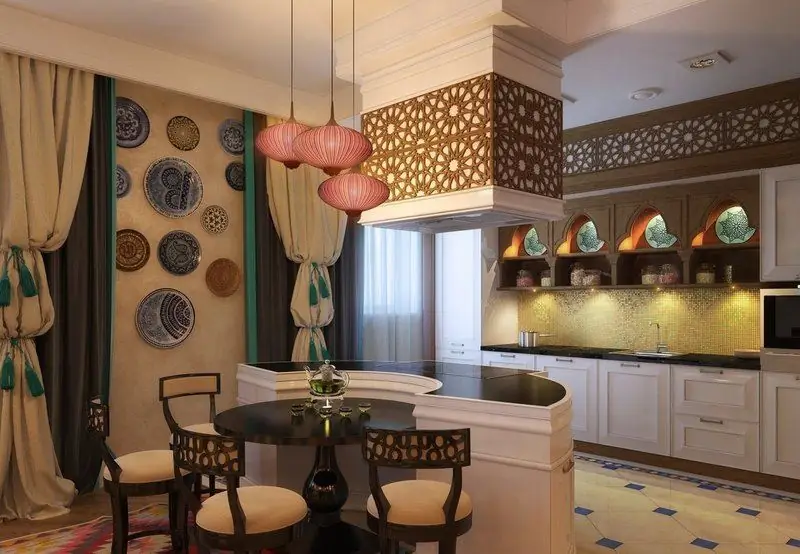
What are the types of oriental design and how to decorate the kitchen. The choice of materials, shades and textures, layout features. Decor and lighting options
